Content Distribution Networks
This post is partially an explanation of an idea around the structure of producer-consumer networks on the web, and partially an experiment in building the tools to talk about these ideas. The actual content will be short, a simple idea, punctuated by a demo.
I was talking to a friend the other day about content distribution networks online. By this I mean a graph of interactions between people publishing content and people consuming content. Examples would be things like Facebook, Instagram, and The New York Times. These examples differ in the structure of the networks they form - if you were to draw a graph, with points for users, points for producers, and a line between them to indicate content flowing from one to the other, you would find very different graphs.
The New York Times, for example, would look like this:
There is one publisher, the Times, which distributes content to its subscribers. The subscribers do not publish content to each other, they only consume content from the publisher.
At the other extreme, there's the idealized social network, in which everyone talks to everyone else:
These are two extreme examples of graphs that lie along an axis from Many-to-Many to One-to-Many publishing relationships. That is, we imagine the graphs exist within a space, and we're viewing graphs along a single line, with social media at one end and traditional media at the other. As you move along the line, the graphs you see vary. What do graphs in the middle look like?
Instagram is an example of a network in the middle. There are a few big publishers, like celebrities, that publish to a lot of subscribers. There is internode chatter amongst the subscribers, and subscribers can follow more than one producer.
I've been explaining the relationships here with words and pictures, and I've sort of sketched out the idea that there's an axis along which all these graphs lie. It would be nice if I could show my readers some interactive diagram that would let them adjust their position on the axis and see the change in graphs that result, so they could get an intuitive feel for the concept:
These graphs are generated by separating the nodes into two types, producers and consumers, requiring that each consumer be connected to at least one producer, and then using three numbers:
- Consumer to Consumer
- The chance that any given consumer connects with another consumer
- Consumer to Additional Producer
- The chance that any given consumer connects with a producer beyond the first
- Producer to Producer
- That chance that a producer connects with another producer
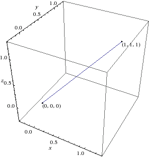
That parameterizes a three dimensional space. The slider moves you along a line segment in that space from (0, 0, 0) to (1, 1, 1). Here is the space visualized on Wolfram Alpha:
