The Four Color Theorem
The Four Color Theorem is a mathematical statement about maps. All the example maps I found on the internet were too complicated to use for an intro, so I decided to make this shitty drawing instead:
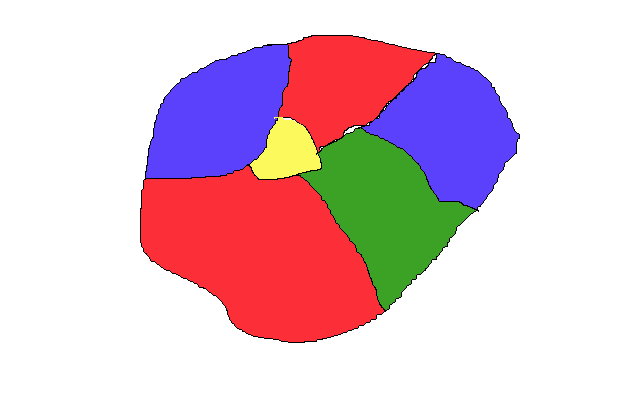
If you squint, you can see that this is the same thing as a graph - you just shrink all the regions to a circle, and connect the circles if the regions were next to each other in the graph:
The four color theorem says that you only need four colors to label any shitty drawing like mine (or its corresponding graph) so that no two adjacent regions are the same color. That means that if you take a map of the United States, of Europe, even with all the weird country borders in the middle there, and give each country or state a color, you'll only need four different colors to label the whole thing.
Some maps don't need all four colors. Some can be colored with two or three. A map that could be colored with one color wouldn't be very interesting, so we'll ignore those ones.
Complexity
What is this about colors? Why should anyone care? Why did I bother to write this blog post? In a word, complexity. We can take the number of colors required to color a graph as an indication of its complexity. More complex graphs will require more colors. To illustrate this, let's take a look at some graphs that require different numbers of colors, and see if we can tell the difference. Go ahead and color the following graphs by clicking or touching the nodes:
The graphs above respectively require two, three, and four colors to color. My hope with this demonstration is to show that the graphs that require more colors are more complex, or at least more disorganized. The two color graph is very well organized; it feels like there is a rule governing which nodes can be connected. The next graphs get more and more interconnections.
Software
The first thing that struck me, as a software engineer, is that four colors is not very many. It seems astounding that any graph could be colored with four colors; I feel like if I drew a graph of some of the codebases I've worked on, with edges connected objects that communicate, they could easily require dozens of color. For example, here is a graph of the code powering this page:
This is not a very complicated piece of code. It's one of the simpler pieces of code that I've worked on. If you take a codebase that has been around for several years, It would be orders of magnitude more complicated.
So, as you've guessed, there is a caveat to the four color theorem. The graph has to be planar. That means no edges can cross each other. It has to be able to embedded on a two dimensional plane without crossings. That means that if you have a graph which has crossings, which can't be embedded in a plane, the four color theorem doesn't apply. It could require more than four colors, but you would need at least three dimensions to draw it without crossings.
Conclusion
The Four Color Theorem reveals a remarkable relationship between space and complexity. In some important way, graphs which occupy only two dimensions are less complex than those that occupy three or more. Why should that be the case?
In linear algebra, the dimensions of a space indicate the degrees of freedom. More dimensions mean more ways in which things can vary. More ways to vary means more complex spaces.